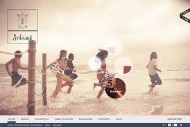
It’s no secret, I’m a fan of websites that are bright, cheery and use lots of in-your-face colors. There are a couple of Art Directors out there that have had to visit their optometrists after dealing with my design feedback.
But it’s not always necessary for colors to pop off the page in order to have a killer website design.
Here are 50 web sites that prove how effective design can be using a more muted color palette.
What do you think? Do you find that you are more pulled in by bright colors? Or are you a fan of pastels?

