I credit my buddy John Zawislak (go ahead, give him a follow at @kapoosta) with bringing the importance of responsive design into my world. As the lead Art Director, John would constantly be researching, learning, improving his skills in the responsive design arena.
This was right at the dawn of the Responsive Design Era, before most people knew it existed. Although in human years, it was only about 4 years ago, that equates to about 150 internet years. Back in those days (in addition to having to walk, barefoot through the snow, uphill both ways to the one computer our town had and we for thankful for it!), John would spend hours and hours designing and coding different versions of the website, allowing for variations in mobile device, tablet, operating system, browser…you name it.
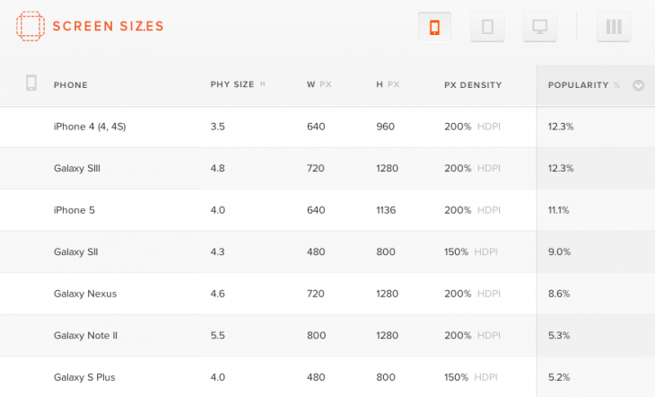
The whole work process was arduous and exhausting. Thankfully, we now have the advent of Screensiz.es – a free service that lets perfection-obsessed designers, such as John, get access to a database to “view smartphone, tablet, laptop and desktopscreen sizes by pixel dimension, physical size and pixel density“.
If you have any designers in your life who work on responsive web projects, please pass this along. They will thank you for it!

